

Research consistently shows that colour accounts for up to 90% of the snap judgement a consumer makes about a product. That statistic has enormous implications for your logo — because your logo is often the first thing a potential customer sees.
Colour psychology isn't magic, and it isn't absolute. But it is a powerful set of cultural associations that operate below the level of conscious thought. When you choose the right colours for your brand, you're communicating values before anyone reads a single word.
The Psychology of Common Brand Colours
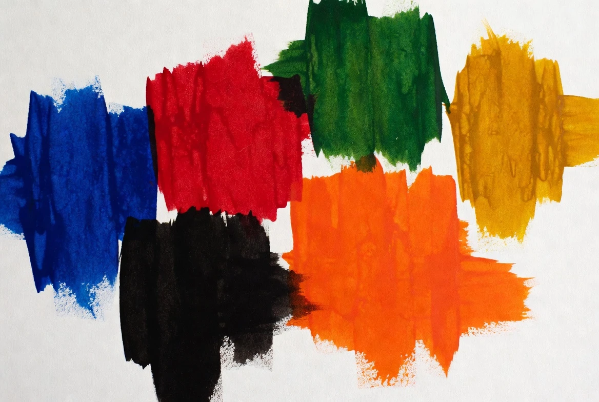
Blue — Trust & Reliability
The world's most popular corporate colour. Used by Facebook, Samsung, PayPal and Ford. Blue signals dependability, professionalism and calm. It dominates finance, healthcare and technology brands.
Red — Energy & Urgency
Red stimulates appetite and creates urgency — which is why it dominates food and retail: Coca-Cola, YouTube, Netflix, KFC. It's bold and memorable, but can read as aggressive if overused.
Green — Health & Growth
Green carries strong associations with nature, wellness and sustainability. Whole Foods, Starbucks and John Deere all use it deliberately. It's the go-to for organic, eco and health brands.
Yellow — Optimism & Warmth
The most attention-grabbing colour in the spectrum. McDonald's, IKEA and Snapchat use yellow to project cheerfulness and accessibility. It's also deeply practical — yellow stands out at distance.
Black — Luxury & Authority
Black communicates sophistication, exclusivity and power. Chanel, Apple and Nike use it to signal premium positioning. Black logos are also extraordinarily versatile — they work on almost any background.
Orange — Creativity & Friendliness
Orange sits at the intersection of red's energy and yellow's warmth. Brands like Amazon, Harley-Davidson and Fanta use it to feel approachable but dynamic. It works especially well for consumer brands targeting a broad audience.
Three Mistakes Brands Make with Colour
1. Choosing what you personally like, not what your customers respond to
Your logo isn't for you — it's for your customers. If your target market is professional corporate buyers, a bright lime green may alienate them regardless of how much you love the colour. Understand your audience first, then choose colours that resonate with their expectations.
2. Ignoring cultural context
Colour associations vary significantly across cultures. White is associated with purity in Western cultures but with mourning in several East Asian cultures. If you have international ambitions, this research is non-negotiable.
3. Using too many colours
Most iconic logos use one or two colours at most. Every additional colour increases print costs, reduces versatility and dilutes the psychological message. If you're unsure, start with one strong colour and one neutral.
How to Choose Your Brand Colour
Start with your brand personality. Write down three to five adjectives that describe how you want your brand to feel. Then map those adjectives to colour associations. Your competitors' colour choices are also worth studying — not to copy them, but to identify gaps. If every competitor in your space uses blue, a carefully chosen green or black might differentiate you immediately.
Finally, test your colour choices in real contexts: on a white background, on a dark background, in greyscale, at small sizes. A colour that looks beautiful in a presentation can become muddy on a product label or unreadable on a dark website header.
Let us find the perfect colours for your brand.
Our professional designers understand colour psychology and brand strategy. Packages from $29. 100% Money Back Guarantee.
See Packages