

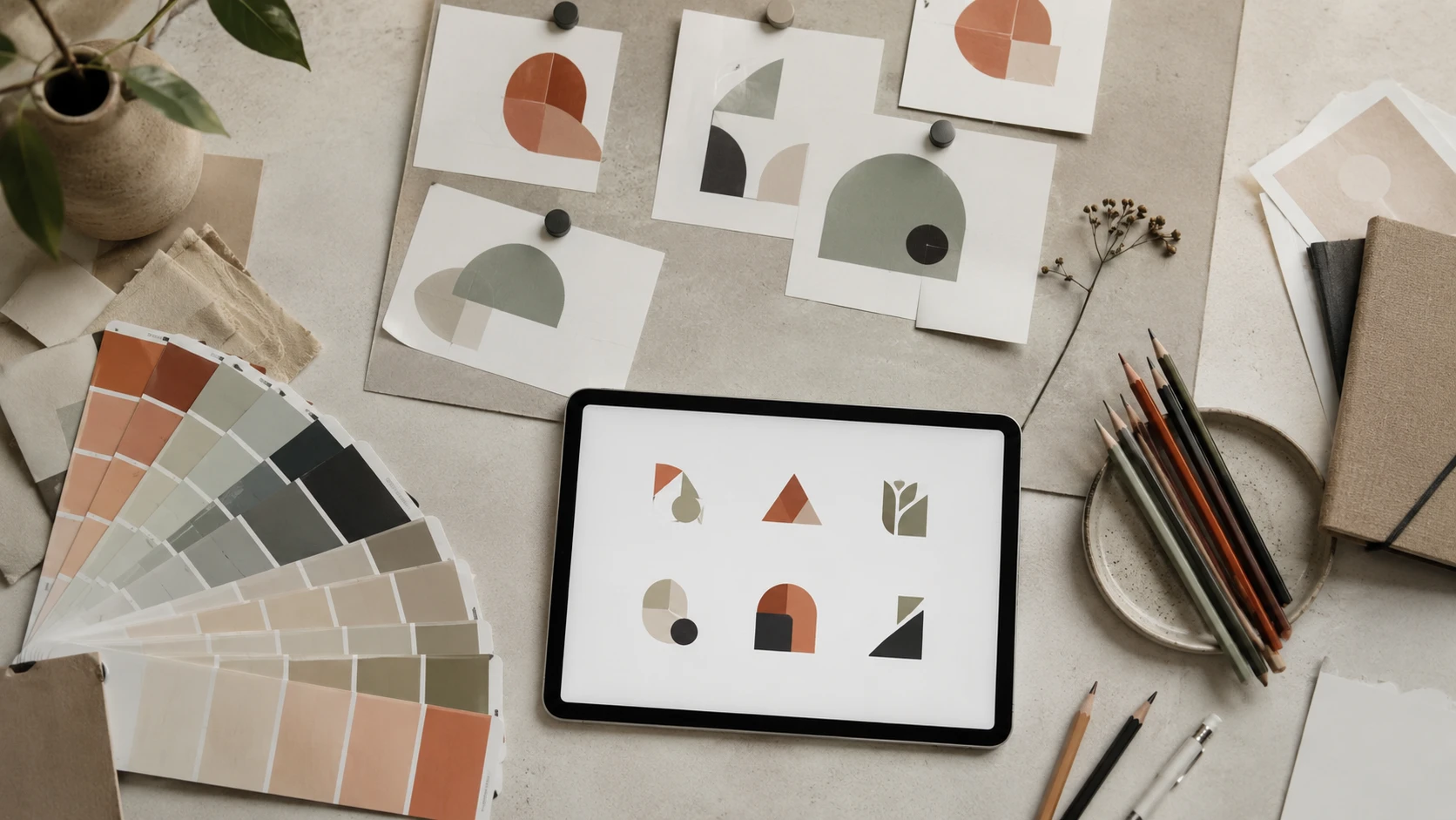
Every year the design world shifts. Colour palettes evolve, typefaces fall in and out of favour, and visual styles move from fresh to clichéd and back again. In 2026, several strong trends are reshaping how brands present themselves — some built to last, others better left alone.
Here's our honest read of what's defining logo design right now, and more importantly, what advice you should actually act on.
1. Geometric Minimalism — Refined, Not Rigid
INClean geometry has been a staple for years, but 2026's version feels warmer and more intentional. Think soft circles paired with precise lines, or hexagonal forms with rounded corners. The coldness of pure geometric minimalism is giving way to marks that feel considered rather than clinical.
Why it works: geometric logos scale perfectly across every medium — from app icons to building signage — and they communicate stability and professionalism without effort.
2. Earthy, Muted Colour Palettes
INElectric blues, neon greens and hyper-saturated gradients are receding. The most talked-about brand identities in 2026 are built on terracotta, clay, sage, warm whites and deep forest greens. These palettes photograph beautifully, work across print and digital, and carry an authenticity that oversaturated colours can't match.
This shift reflects a broader cultural appetite for sustainability, craft and the tangible — all values that earthy tones communicate naturally.
3. Variable and Kinetic Logos
INWith brands increasingly living on screens, static logos are being joined by animated and adaptive counterparts. A logo might subtly breathe, shift colour based on context, or reveal a secondary meaning through motion. Tech companies, media brands and challenger businesses are leading this charge.
Important caveat: a kinetic logo still needs a rock-solid static version at its core. Motion enhances; it doesn't rescue a weak mark.
4. Wordmarks with Custom Lettering
INAs more brands compete digitally, the logomark (a standalone symbol) is harder to own distinctively. In response, custom wordmarks — where the company name itself becomes the visual identity through unique letterform design — are surging. These logos are immediately readable, deeply ownable and work at any size.
Brands like Notion, Figma and Stripe have popularised this approach, and smaller businesses are following suit.
5. Over-Illustrated Mascots
OUTThe trend of hyper-detailed character mascots with shading, texture and personality-packed expressions had its moment — but it's aging quickly. Complex illustrations struggle at small sizes, date fast and are expensive to maintain across brand materials.
If mascots are right for your brand (food, children's products, sports), lean toward simpler, more graphic interpretations that hold up at any scale.
6. Gradient Overload
OUTInstagram-era gradients — particularly purple-to-pink and orange-to-yellow — are now firmly associated with the late 2010s. While gradients themselves aren't dead (subtle, well-executed transitions still work), the heavy, multi-stop gradients that defined so many tech logos from 2016–2022 now read as dated.
What Actually Lasts
Trends are worth knowing, but they're a dangerous foundation for a logo that needs to serve your business for a decade. The enduring principles — simplicity, memorability, versatility, appropriateness — haven't changed and won't. Use trend awareness to inform colour and typography choices, but build your core identity on something more durable.
The most resilient logos in 2026 aren't the trendiest. They're the ones that are clear, confident and unmistakably themselves.
Ready for a logo built to last?
Professional logo design packages starting from $29. Our designers stay ahead of the trends so your brand doesn't have to chase them. 100% Money Back Guarantee.
See Packages