

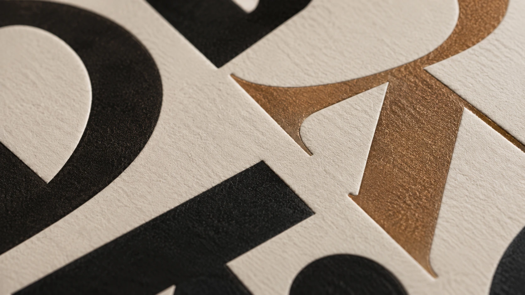
When most business owners think about their logo, they focus on the icon or mark. But in many of the world's most recognised logos, typography is doing all the heavy lifting. Google, Coca-Cola, FedEx, Subway — these are all logotypes: the brand name rendered in a distinctive typeface, with little or no accompanying symbol.
Even in logos that combine a mark with a wordmark, the typeface choice powerfully shapes how the brand feels. Get it right and your brand feels intentional and credible. Get it wrong and something nags at the customer — a subtle sense that things don't quite add up.
The Four Major Type Categories and What They Communicate
The small strokes at the ends of letterforms signal tradition, authority and trustworthiness. Used by luxury brands, law firms, publishing houses and financial institutions. Think Vogue, The New York Times, Ralph Lauren.
Clean, modern and highly readable. Sans-serif typefaces communicate clarity, efficiency and forward-thinking. The dominant choice in tech, retail and consumer brands. Think Apple, Nike, Google.
Flowing letterforms suggest creativity, warmth and personal touch. Used by hospitality, food, beauty and artisan brands to feel approachable and human. Think Coca-Cola, Ford, Cadillac.
Distinctive letterforms with strong personality. Communicates specificity, expertise or quirkiness depending on the design. Popular in tech startups, agencies and challenger brands.
Why You Should Never Use a Generic Free Font in Your Logo
Free fonts are excellent for body copy and presentations. They are not a good foundation for your brand identity, for three reasons:
- They are widely used. When thousands of businesses use the same free font, your logo loses distinctiveness by association.
- Licensing is complicated. Many free fonts have restrictions on commercial use that are buried in their licence agreements. Using them in a commercial logo without the right licence creates legal exposure.
- They lack custom character. Custom or premium typefaces come with more complete character sets, better kerning and the option to modify letterforms — all of which matter when fine-tuning a logo.
The most distinctive logos often feature custom lettering — typefaces that have been drawn specifically for the brand, or commercially licensed fonts with individual letterforms modified for uniqueness.
Kerning: The Detail That Separates Amateur from Professional
Kerning is the spacing between individual pairs of letters. It's one of the most important and most overlooked aspects of logo typography. Poor kerning makes a wordmark look unbalanced, rushed or amateurish even if the typeface choice is excellent.
Professional designers adjust kerning letter-by-letter, accounting for the optical illusion created by different letterform shapes. Two letters that appear the same distance apart mathematically may look uneven to the human eye — and kerning compensates for that difference. This is a skill that takes years to develop, and it's one of the most concrete things that separates a professional logo from a template.
Typography Trends Worth Knowing in 2026
Variable fonts — typefaces that can shift weight, width and other attributes along a continuous axis — are becoming more common in brand systems, enabling logos that adapt dynamically across digital contexts. Geometric sans-serifs continue to dominate, but with more warmth in their construction than the cold geometric styles of the early 2010s. And custom wordmarks are resurgent: as distinguishing a standalone symbol becomes harder, many brands are investing more in the letterforms of their name itself.
Typography that works as hard as your business.
Our designers choose and customise typography that perfectly fits your brand personality. Packages from $29. 100% Money Back Guarantee. Over 50,000 logos delivered worldwide.
See Packages